Wedding websites have gone from trendy to essential! They are convenient, cost effective and engaging. From invitations and RSVPs, to song requests and digital galleries, there are so many fun ways to make a wedding website personal and unique to you and your partner. However, creating your website can seem overwhelming, so it's important to find some wedding website examples and templates to get you started.
Your wedding website should be both filled with important information and made to get guests excited about your big day. Using colors, styles and fonts that you will incorporate in your wedding is a great way to set the mood for the event.
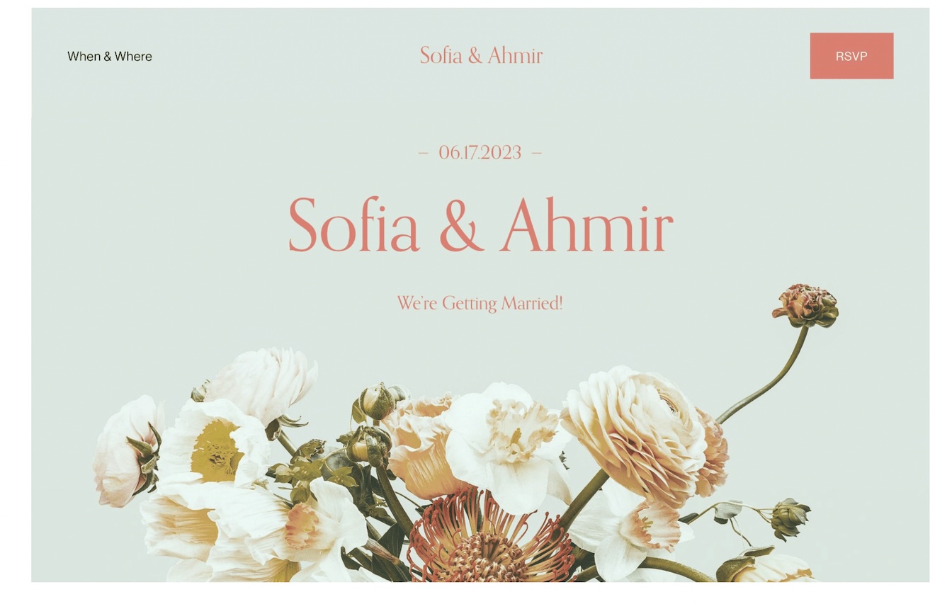
Below are 24 stunning wedding website examples to get you excited and give you some inspiration. From simple to extravagant and everything in between, you're sure to find something that matches your style. Some of the options below even offer wedding website templates that you can use to start your wedding website easily.
Before we get started, let's quickly run through the key elements that make a wedding website great.
Practical, personal and easy to RSVP.
Your wedding website should be easy to navigate, informative and fit for purpose.
Put yourself in their shoes - if you were attending your wedding as a guest, what would you need to know? Try to include all of the information your guests may need to prepare them for the big day.
What you'll need to include: Start with all of the basics.
Most wedding website templates will include space and placeholders for these.
Some other parts of your wedding website are non-essential, and just nice to have:
Personalize it! This is your special day and your website should reflect that.
You guests are coming to celebrate you as a couple, your love story, and your future together.
Adding a few personal touches to your website will endear your guests to you, and add to their excitement in celebrating your marriage.
Not sure where to start?
Include your love story! There's nothing more personal and unique than that and it is what the celebration is about, after all. Whether it's a timeline, a short blurb, or a poem, finding a unique way to include your story is a surefire way to create a fabulous wedding website.
If you met on Tinder and you don't want your grandmother to know, you can also add pictures from special moments and memories in your relationship or quirky anecdotes about you as a couple. There are plenty of ways to personalize your website, you can just get a little creative.
Most importantly, make it super easy for your guests to tell you they'll be there! You want your guests to be able to RSVP with the click of an easy-to-spot button. The easier it is for them to RSVP, the better. It's also a good idea to get their dietary requirements at the same time. If you're doing a multi-day event, you can include more than one day in your RSVP and let guests choose which event(s) they'll be attending.
The important bits and bobs above will make it easy for your guests to attend, but there are also some additional touches that will get your guests in the mood to celebrate!
Whether it is small or big, no detail is unworthy of being on your wedding website. From using your chosen color scheme and font, to adding your wedding playlist and asking for recommendations. There are a whole lot of fun things you can do to make your wedding website interactive and to set the tone for the day ahead.
Here are some fun wedding website examples to work with:
So you know what a good template for a wedding website looks like, now lets get into some of the best wedding website examples.
Okay, enough of the (really important) chit chat, we know what you came for ... let's see some example wedding websites!
We'll tell you what we love about every single one of these so that you can decide for yourself.
1. Farmland Festivities

If you're having a rustic wedding and want to set the mood but keep a clean aesthetic, this page with subtle farm details is sheer perfection.
The super subtle farm house logo is a great way to set the tone for the day without overpowering your guests. Adding a fun and personal blurb on each part of the schedule is a unique way to personalize your wedding website, share bits of your love story and keep people interested.
Try this design for free.
2. A Pop of Color
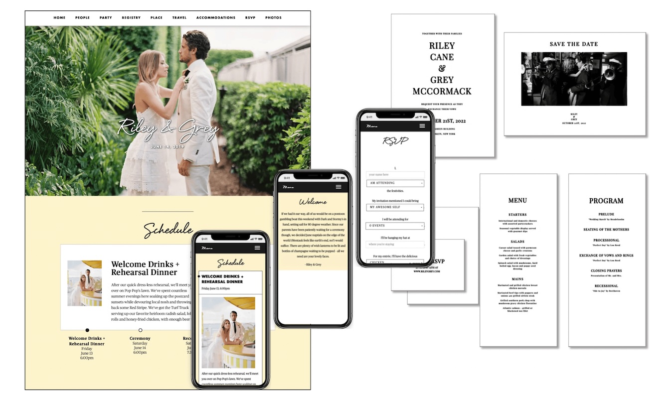
Delicate lettering and a pop of color. No guessing what we love most about this page!
On this website, the images are the stars of the show, and are complimented so well by the choice of colors and font. The font is elegant and understated, and it takes nothing away from the beautiful first picture. While the yellow background underneath serves to enhance the image and bring a happy vibe to the page.
Try this design for free.
3. Smell the Flowers

Tell us you're having a beautiful summer wedding, without telling us you're having a beautiful summer wedding.
If this design doesn't leave you breathless, we don't know what will. This beautiful floral design is intricate and detailed, without feeling overwhelming. The brown paper-like background perfectly breaks up the floral and allows you to see all of the important information without compromising the design.
This is a 10/10 for us, we just love it!
Try this design for free.
4. Garden Gala

What can we say? Flowers are in this season (and every season).
Flowers and weddings go hand-in-hand, and this gorgeous invitation sets the tone for a super fun garden party. Everything about this invitation says fun. We love the count down, the RSVP section and playful "you won't want to miss this"!
From the flowers to the font, this website is to die for.
Try this design for free.
5. Neutrally
If you're into neutrals, this is the perfect wedding website for you!
Simple, stylish and effective, this wedding website is great if you're looking to create a more rustic and relaxed vibe. This website page draws guests attention to the pictures you choose to display, so pick wisely. Try to incorporate some earthy tones to complete the look.
Try this design for free.
6. Vineyard Vows

This beautiful wedding website sets the tone from the first click. It immediately transports you to golden hour in the vineyard.
The couple have made made their venue the focal point and the rest of the website is created around it. No detail has been left unattended to, from their personalized logo, to the pops of champagne color and classy font.
We love the way their story is the first tab, this emphasizes the importance of why everyone is coming together to celebrate. The way they set out the important information in a short, concise way and follow it up with the "nice to have" information is also great as it shows the guests that the couple was thinking about them in the process and didn't just add it as an afterthought.
Lastly, we love the the maid of honor and best man pics and bios. This goes a long way towards breaking the ice and keeps things light and fun.
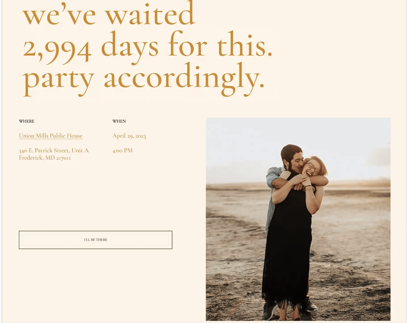
7. Counting Down The Minutes

There are so many things that are right about this website. Simple, yet effective. All of the important information features up front an centre and you don't need to know anything else to be able to RSVP.
Again, the small details like their logo and sweet background picture should not go unnoticed. They also included a sweet note from the bride and groom, and the addition of a countdown is a great way to get guests excited for your big day!
8. Minimalist Matrimony
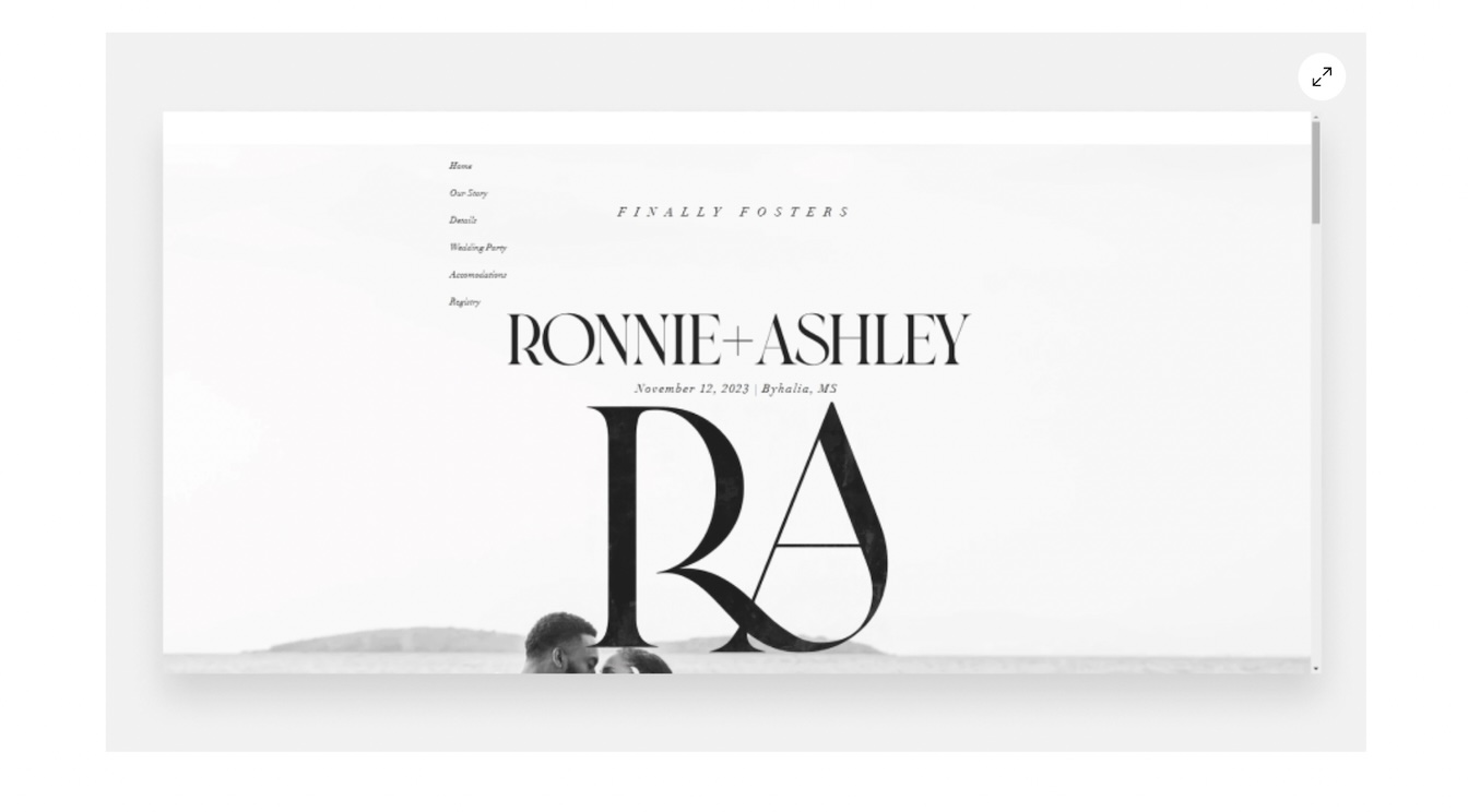
Minimalistic, yet personal. Not only is the first page of this wedding website absolutely beautiful, it is also surprisingly personal and informative.
We love that they included their personalized logo in such a big way. This is usually something that is placed in a corner of the page but it suits this website look so well.
They also give a hint that this has been a long time coming with the phrase "Finally Fosters" printed on the top. This gives us a sneak peak into their story and makes us excited to read all about it and celebrate it when the day comes! Like some of the other pages, they've got the most important details on the front and entire tabs dedicated to all of the other details.
9. Urban Oasis
The tone is set and this website screams urban oasis! The background image on the first page is perfection. It is not only interesting and great at setting the mood, but also makes the couple the focal point and allows the writing on the page to stand out. We love the clean, simple design with this magnificent image in the background.
The RSVP in a white box in a corner on its own is great as a call to action for guests.
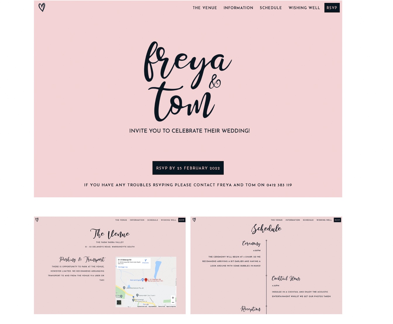
10. The Party Page
It's time to party! What we love most about this page is how excited it makes you feel. You just know that this is going to be a wedding to remember and that celebrations will be in full swing. The couple have chosen a very simple, yet effective and personal message to put on their page and they don't want anything to take away from it - they've been together for ages and they're ready for a super fun celebration.
Can we also have a moment for the RSVP? All the details are there for you to see and the choice is there to be made, you'll be there! This is a great way to get your guests to RSVP quickly and positively.
11. Something in the Simplicity
Simple and sweet, this website page screams love. This website reinforces that less is sometimes more, you don't need a super fancy wedding website page if that's not your vibe.
P.S We love that they included a google maps location to make it super easy for their guests to find!
12. Bohemian Bliss
Can we take moment for the color palette, please?!
The colors, the flowers, the font ... it is all perfect to fit the bohemian vibe. In our opinion, this website page sets the tone for a fun filled and wholesome day.
13. Bold Choice
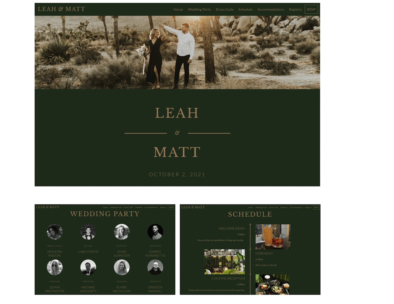
Nothing is taking away from that beautiful first page! The forest green background works so well with the magnificent picture they have on the top half of the page. It is striking and immediately grabs your attention.
We love the way they have included pictures of each member of the wedding party, indicating that they make up a really important part of the day. The little notes under each event on the schedule bring some fun to the page.
14. Illustration Station
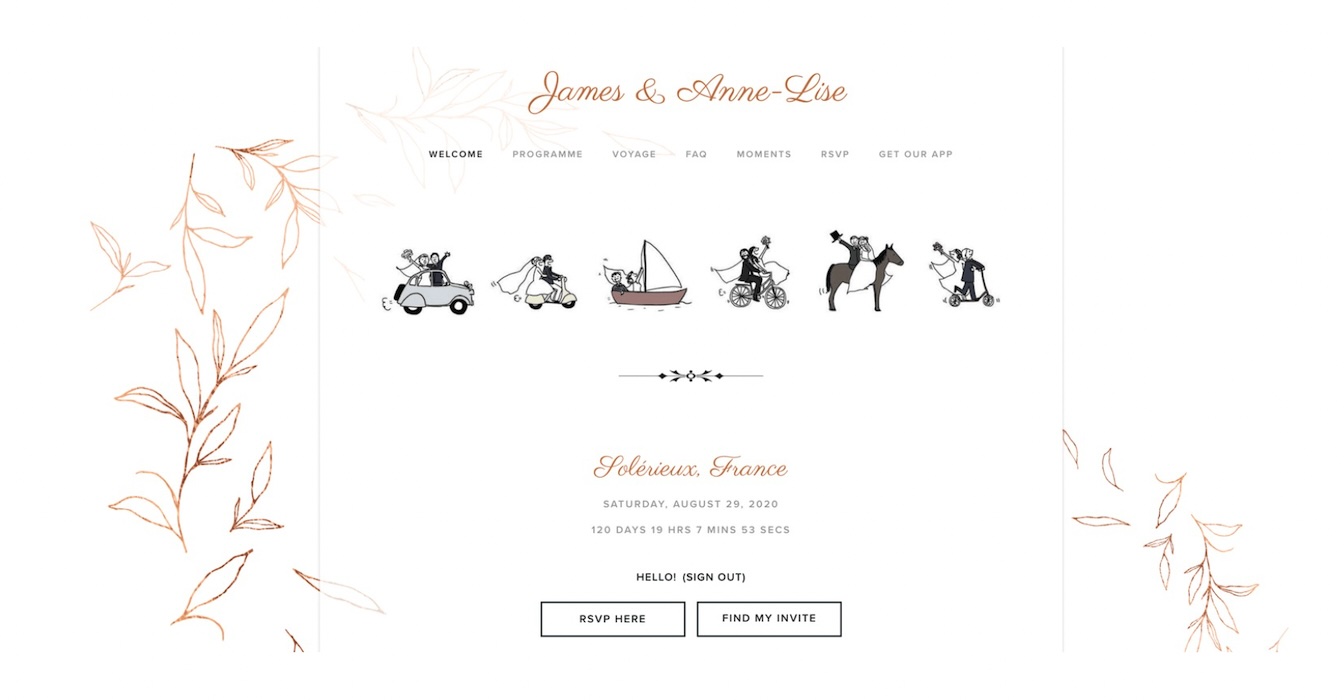
In our eyes, this wedding website is perfection.
James and Anne-Lise really ticked all the boxes so we'll make this one quick: We love the illustrations, they are fun, super cute and say a lot about the couple! The words used for each page are so well thought out and help carry the theme through the entire website. There's a count down and a super accessible RSVP button. We love this website design!
15. Garden Party

The background picture is the hero of this wedding website, and they know it.
Sarah and Stephen have said all they need to with a beautiful picture and three important words. But, our favorite feature lies below the fold. The couple have designed a pop quiz based on their love story which, a fun and interactive way to get your guests involved from the very beginning.
16. Coastal Chic

This wedding website idea makes you feel like you're in a seaside town.
The colors, font and lighthouse drawing all help to set the mood for what's sure to be a chic coastal wedding. The website is perfectly designed around a core engagement picture that exudes happy, beachy vibes.
17. Perfect Pair
Last one, we promise! But florals and wedding websites just go so well together, a match made in heaven!
We love the simple elegance of this design. The barely blue background, splash of pink in the font and cool tones of the flowers just set the mood for a beautiful day.
Also, we know you're supposed to give your guests all the information on a wedding website but it's kind of nice that it's tucked away under some simple text in the top left corner for this one. There's something a little bit secretive about it.
18. Bougie Boogie
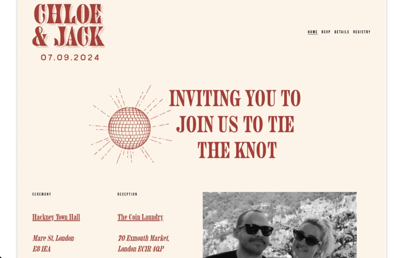
Another one of our favorite picks!
This well thought out and fun design really gets us in the mood for a boogie.
The color scheme, font and black and white photograph give us a distinctly retro vibe, and definitely conveys that the couple aim to spend their big day dancing the night away.
Super fun, but still informative and functional. We're big fans.
19. Modern Day Love Story
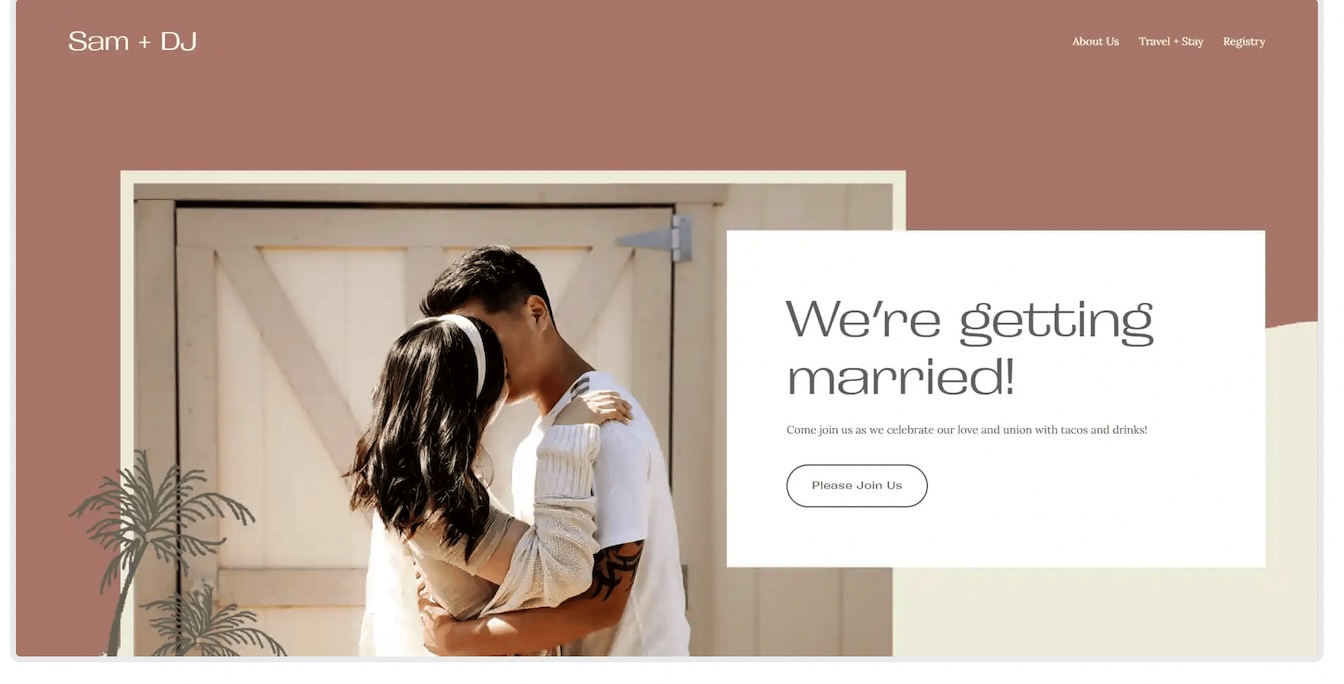
If you're a modern day couple, going for a modern day vibe, something like this will be perfect for you.
Not only is this website well designed and visually appealing, but it also perfectly matches the tone of the wedding celebration (tacos and drinks? We're in!).
20. A Black & White Moment

This picture perfect black and white wedding website moment is everything.
The design enhances the elegance and beauty of the picture and still manages to set out the important things such as date, location and the RSVP button (of course). The top left corner subtly holds their personalized logo and there are different pages for each bit of important information.
21. Join us Online
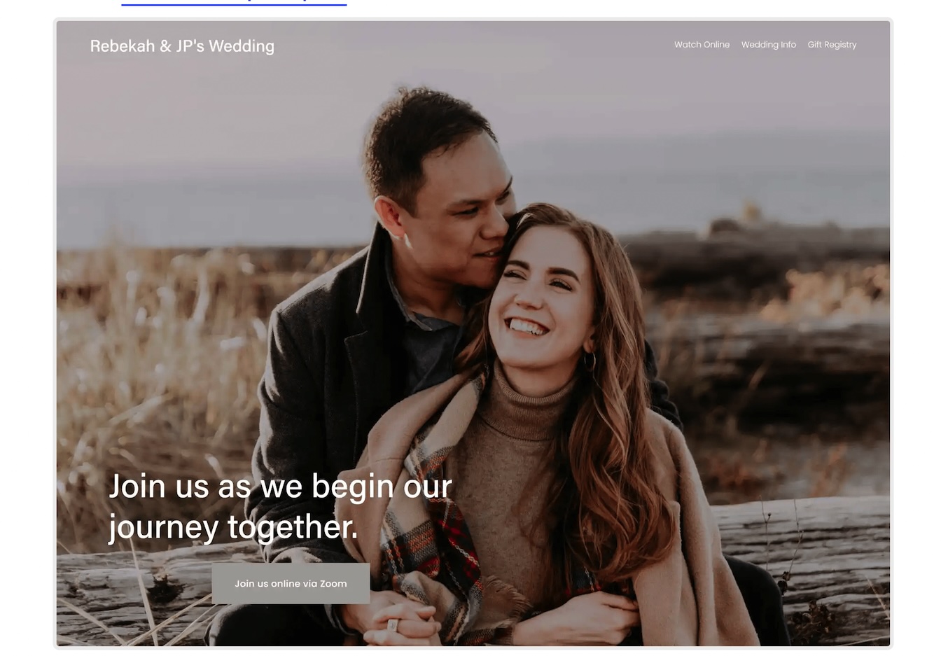
You didn't think we forgot did you? If you'll be hosting your wedding online rather than in person, here's a little bit of inspo for you.
There can be no confusion about where this wedding will take place with the "join online" button being the only option on the main page. This is a great way to manage the expectations of your guests from the first click.
No need for an RSVP but you can still add in some personal details, like your love story. A gift registry tab is also still an important feature.
22. One Pager

Short & Sweet! One page, all the important info and a happy picture of the couple and their furry friend.
If you aren't the type for details, or you just don't feel like creating a multi-page wedding website, this is the perfect choice. It's personal, it's informative and its rather unique.
One suggestion, if we may, include an RSVP button, it'll make everyones lives easier.
23. Vintage Vows
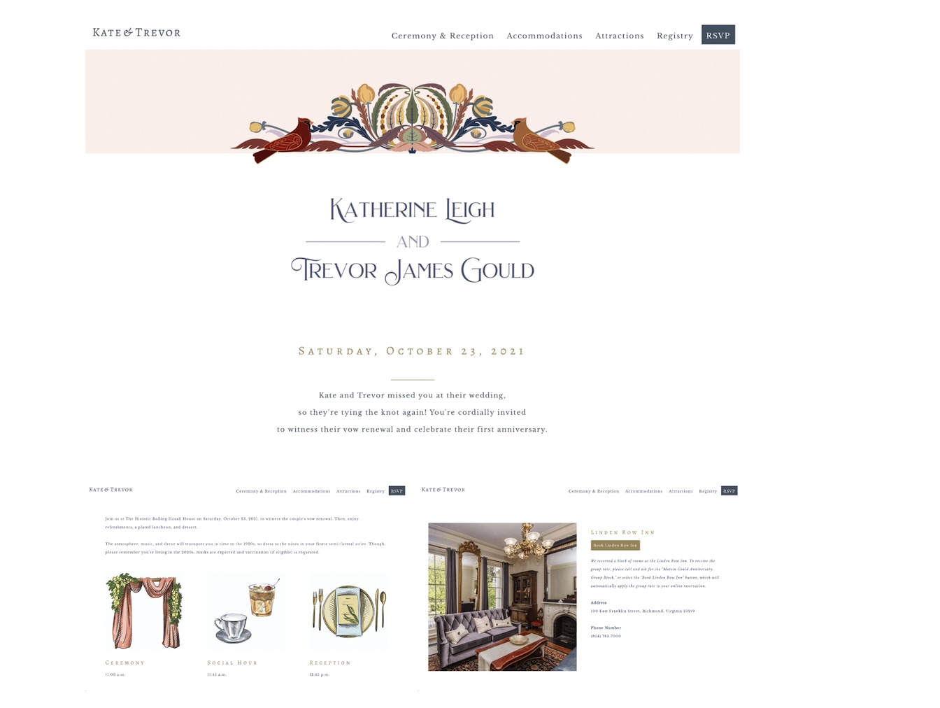
There's something special about this one.
The details and colors transport you straight back to the roaring twenties. Elaborate outfits and snazzy parties, this surely won't be an event to miss.
Our favorite things about this website? Hard to choose, but if we had to, we'd say the detailed drawings and linked hotel accommodation.
24. For Like Ever
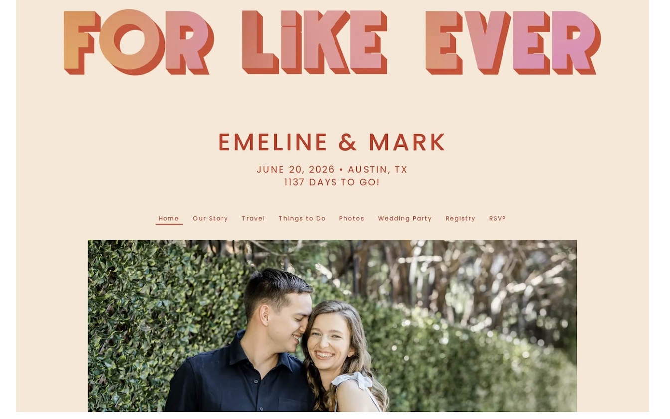
Just for kicks, we had to include this one for the millennials!
This is so cute and fun, it's the perfect design for the young couple tying the knot. The colors are bright, the mood is happy and you know the emphasis is on fun for this celebration.
That about wraps it up on the inspiration side of things. We'll give you a couple of quick tips next and then we'll leave you to get designing!
We wen't through the three P's, now here are the five F's. These are some key tips and tricks to make designing your dream wedding website as easy as possible:
Hopefully this gave you some much needed inspo for your wedding website!
Get started.
